By Reach Brands
Even with the recent fall in inflation there’s no denying that household budgets in the UK are being squeezed to a degree that hasn’t been seen in generations.
In such cash-strapped times, cold business logic would insist that consumers merely follow the path of least resistance, homing in on cheap brands and products that provide, and strongly communicate, value for money.
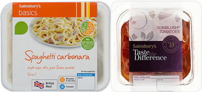
A theory that would appear to be borne out by research from Kantar Worldpanel showing that the Sainsbury’s Basics brand has seen a 10% jump in sales over the last year. But the story doesn’t seem to be as clear-cut as all that, with Sainsbury’s also reporting a 12% bounce in their high-end Taste the Difference range.
Such healthy figures for products at opposite ends of the marketplace suggest that consumers aren’t simply prioritising low prices over quality. As Joanne Denney-Finch, CEO of retail experts IGD, put it recently: “Even though people are facing a squeeze on incomes, when it comes to their food and groceries they’re not just focusing on price. Quality is still important.”
All of which makes us at Reach wonder how manufacturers and retailers are redesigning their packaging and repositioning their brands to best communicate the balance of quality and price that brings a sense of value for money.
What’s Out There? Of Course!
Loud and Proud
Some companies are stressing the out-and-out value of their products with simple on-pack communication and strong product images. This reassures consumers that they are buying a quality name brand at an affordable price.
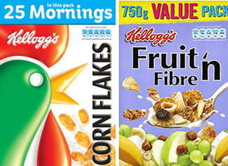
Kellogg’s Value Packs – The world’s biggest breakfast cereal company has gone for eye-catching statements across their product range that:
- Highlight the value of larger packs, emphasising the age-old shopping truth that the more you spend, the more you get for your money.
- Show exactly how many breakfasts a consumer will get for their buck through clear product claims.
Galaxy and Nestle – Both have ranges of £1 bars that prominently feature price as part of the wrapper design.
These are also both uses of round pound value, a technique popularised in the last few years with the move away from 99p labels in favour of clearer pricing.
This shift means that manufacturers and retailers can:
- Create trust, as round pound pricing seems more honest and less bamboozling than “four for £1.69” type offers.
- Make it easier for customers to add up what they are spending each week, something more and more shoppers are doing now that most people are watching the pennies.
Spot the Difference
From on-pack design to price wars between retailers, it seems everyone is giving consumers the tools to compare costs.
Weetabix and Washing Powder – Breakfast cereal and detergent don’t often get mentioned in the same breath, but there are similarities in the way both communicate pack contents and value for money.
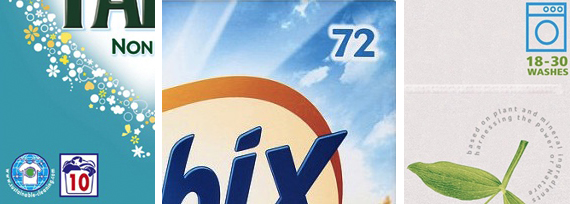
Weetabix states how many biscuits a box contains, while laundry detergent brands like Fairy or Ecover have taken a leaf out of Kellogg’s book, and tell the consumer how many washes they’ll be getting per pack.
Throw major supermarkets’ on-shelf pricing into the mix, with its price-per-unit and price-per-100g info, and customers can immediately compare the basic cost of one product against a competitor displayed next to it. Which makes us think that the most isn’t being made of these tools and that the following must be possible:
- Price-per-portion information on the actual packaging.
- A way to compare not only price but also quality.
- On-pack information less difficult to spot.
Sainsbury’s Instore Brand Match – Launched last October, the Brand Match initiative links the prices of branded products at Sainsbury’s to those at Asda and Tesco. By following these three steps, Sainsbury’s has repositioned itself as a more price-conscious retailer that can make quality brands more affordable to its customers:
- Daily price-checks assuring shoppers that they are getting the best value available on brands – a fact communicated through powerful instore signage.
- Vouchers given at the till communicate how much consumers have saved by shopping at Sainsbury’s.
- Customers issued with money-off coupons in the event that Sainsbury’s was more expensive on brands than their competitors.
Fake Can Be Just As Good – Making Value Ranges Work
Launched in 2009, Waitrose Essentials proves that budget own labels need not damage core brand equity. In Essentials’ case it’s all about the simple product images that look like hand-drawn illustrations. Even though they’re on budget range products, they still convey quality in exactly the kind of underplayed way you’d expect from Waitrose.
And with double-digit growth on sales of Essentials products in 2011, it would seem that this packaging has enabled the upscale supermarket to successfully communicate that this brand extension offers consumers Waitrose quality, but at affordable prices.
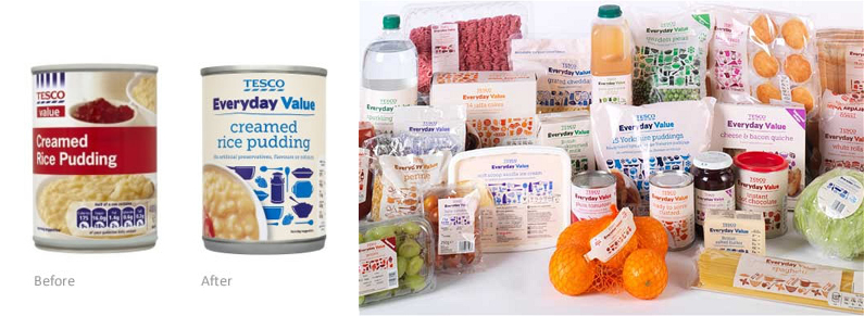
Tesco took a similar tack when they recently replaced their long-running Value range with the new Everyday Value. It’s a selection of products that, according to Tesco UK Marketing Director, David Wood, “taste better, look better and are healthier – still at the same great price”, and were apparently developed after Tesco listened closely to its customers.
The rule from both these ranges is that if it’s to be successful, even the design identity of a budget range needs to echo the brand values and positioning of the retailer or manufacturer.
Surprising!
While some manufacturers and retailers are communicating the balance of price and quality that brings value for money, others, those that just can’t compete in this arena, have chosen to emphasise the alternative aspects of their brands and products that they think will reel shoppers in.
Rachel’s and Yeo Valley – After dropping “organic” from their packaging three years ago, Rachel’s has brought it back in a recent redesign. An odd move given that organic food sales fell 5% in the last year, a fact Kantar Worldpanel attributes to consumers beginning to dismiss this sector as a “middle-class affectation”.
Fascinatingly, Rachel’s competitor Yeo Valley has recently chosen to minimise “organic” on their packaging. Instead, Yeo Valley is stressing their cosy rural provenance with the introduction of “Family Farm” to their logo, while moving any mention of “organic” to a peripheral product claim.
Presumably Yeo Valley’s move is based on insights like that from Kantar Worldpanel, and suggests that shoppers are assuming organic products will be out of their range without even looking at the price.
Here at Reach we wait to see how these two brands, with seemingly different attitudes to communicating their organic origins, duke it out in the chiller cabinets this summer.
How to Embrace the Trend
Less is More – No One Likes a Show-Off
While Waitrose Cooks’ Ingredients may have won The Grocer award for Best Own Label Range in 2007, the plain designs for their labels don’t exactly shout high quality from the rooftops. Which is strange because they’ve been one of Waitrose’ strongest sellers for the last few years.
Similarly The Berry Company has adopted simple packaging for a range of juices including goji, acai and pomegranate. Rather than go for the busy lettering and cluttered, colourful design preferred by many juice and health food brands, they’ve adopted two-tone cartons with minimal product images.
The idea with both these ranges appears to be the use of minimal design that let’s the purity and equality of the product speak for itself. That way alarm bells about price aren’t ringing in consumers’ heads and there is no feeling of being duped or paying over the odds.
Vista-Vision – See the Bigger Picture
With Waitrose enjoying significant growth in the last few years it would appear that the secret of success in signalling value is not only finding the sweet spot between perceptions of quality and price, but also in implementing and communicating this balance in as many ways as possible.
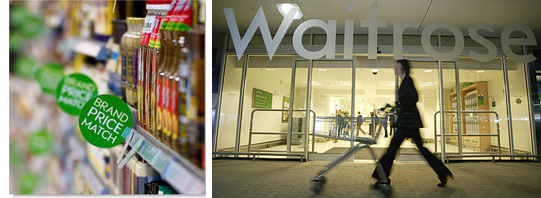
They began this with the simple packaging for their Cooks’ Ingredients and continued it a design identity for their Essentials range that feels basic but still looks like the type of quality product you’d expect from Waitrose. Add to that their own recently extended, and strongly communicated, brand match on over 7000 items with Tesco, and you have a retailer who has repositioned their brand identity to live up to the tag-line of their 2011 campaign, “1000s of Ways to Great Value”.
You Can Be Basic, But Don’t Look Too Cheap
With the own brand market worth a whopping £37bn a year, the double-digit growth in Sainsbury’s Basics mentioned above is just the tip of the iceberg. It’s no wonder retailers are falling over themselves to perfect and extend their own label offerings.
Marks and Spencer have just entered the fray with the launch of Simply M&S. Picking up on the way Waitrose has used pared down designs to cue both quality and value, the packaging of this range has a more basic look and feel than that usually found in the M&S Food Hall. This is a first impression backed up by prices that are more in line with a major supermarket than a prestige retailer.
This all bears out Joanne Denny-Finch’s point from earlier that “quality is still important to shoppers.” Currently it seems that while consumers want quality, they also want it at an affordable price. It’s a balancing act that creates the perception of value for money and is strongly responded to when communicated through basic but attractive packaging.
