![]() By Caroline Hagen
By Caroline Hagen
Whether we’re working to create cut through in the supermarket healthcare aisle, or creating striking OTC packaging designs, Reach helps customers find, identify and return to your product again and again. Over the years, we’ve found three key focuses help: make it easy to buy the right product; be distinctive in the category; and where you can, be emotional and functional.
Make it easy to buy the right product
Why it matters?
When it comes to over the counter (OTC) healthcare products, many purchases aren’t made regularly. Whether it’s holiday prep or distress driven by illness, or perhaps a seasonal purchase to soothe allergies, many shoppers won’t be as familiar with a range as they might groceries in the supermarket. Effective OTC packaging design not only makes it is easier for them to choose and buy – consumers will have warmer feelings towards your brand as a result, making them more loyal.
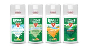
Reach & Jungle Formula – adding an ‘IRF’ to lead the way
 We created a unique feature for this popular range of insect repellants – a device to communicate the Insect Repellent Factor (IRF). This front-of-pack design feature feature is unique to Jungle Formula, and familiar to shoppers as it borrows from the suntan lotion SPF indicator. The apparent familiarity of the IRF helps shoppers quickly decide which product is right strength for them. It also makes the implications of buying a natural or a sensitive alternative to the standard option crystal clear. The strategy certainly worked, with sales increasing 26% within 3 months of launch. Jungle Formula case study.
Be distinctive in the category
Why it matters?
Following the standard design cues in a category can feel safe and reassuring for a client, particularly in healthcare packaging. However, playing the rules isn’t always isn’t great for sales if you’re launching a new brand or product. How are you going to stand out and steal a march on your competitors if your pack and proposition are similar to theirs? If we can persuade you to be a bit braver and break a few rules, the rewards can be very exciting – as the team at Bronchostop discovered.
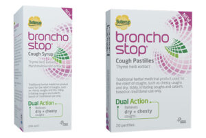
Reach & Bronchostop – breaking the rules to stand out on shelf
 We’ve built a great working relationship with Omega Pharma, which enabled us to really push boundaries together for the launch of their new Bronchostop range. Together we bucked the healthcare packaging norms – dark warm colours with technical drawing images of throats and lungs. Instead, our pack is predominantly white with a pink logo and symbol. It’s a brave decision that’s really paid off. Cut through on shelf is instant, drawing new consumers to it at the fixture and enabling loyal consumers to find their brand of choice instantly when they return to purchase again. And fortune has certainly favoured the brave: Omega Pharma gained a 10% market share within just 5 months. Bronchostop case study.
Be emotional and functional
Why it matters?
In the world of skincare packaging design, it can be tempting to rely on beautifully designed typography and a logo, letting the brand and claims do the talking. However, if you can also add relevant imagery or iconography that connects emotionally, you can really steal a march on your competitors. Better yet, if that imagery encapsulates an idea that can be further brought to life in brand activation, beauty packaging design really starts to deliver for you.
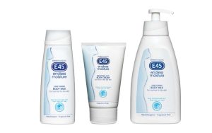
Reach & E45 – creating emotional impact
 The sensual outline of the female form created out of water encapsulates Endless Moisture’s product proposition of phenomenal moisturising. And that’s not all – it also provides a striking and unique symbol on the fixture. The skincare packaging design does the job of emotionally capturing the proposition so well that E45’s advertising agency adopted it within their campaign – praise indeed! E45 case study.
