![]() By Caroline Hagen
By Caroline Hagen
When shopping in the supermarket have you ever wondered why you choose to buy one brand over another? Do you know what draws you to a particular brand?
As a marketer or brand owner, do you know how you can optimise your brand to make it first choice for your target consumer? You can affect a consumer’s response to your brand within the first few seconds of them coming into contact with it; you have the capability of turning a browser into a buyer.
How? By creating a strong and positive emotional connection to your brand on shelf. Good, distinctive packaging design has the ability to trigger that emotional response and connect a consumer with your brand instantaneously.
Who hasn’t bought a bottle of wine, based on the label design alone? What made that bottle stand out? Was it the colour, the illustration, the simplicity of the typography, the texture of the paper, the label shape that drew you to it? What was different to the rest? Do you even know? I bet it was an instinctive, gut reaction. That’s because most decision making (especially about brands) is emotion based. We simply make too many decisions too quickly for them to involve logical thought.
Whilst there may not apparently be any deep or ‘logical’ thought from the consumer, there is, however, a lot of consideration built into the pack design and visual language to ‘manufacture’ a spontaneous emotional response from consumers. There’s a skill in being able to build in key behavioural triggers, and totally bypass the logical thought process of a consumer.
Deciding on what those triggers should be comes down to knowing your consumer and what they’re looking for. Are they looking to be taken to a place of escapism, or do they simply want to be convinced of efficacy?
Identifying the opportunity, defining the brief tightly, finding the big idea, then seeing it through all the way to execution is key. Designers use their skill in typography, colour, shape, imagery and semiotics to build in visual cues and implicit communication relevant to the target audience. They build in cultural insights and craft stories to make the brand territory and touchpoints really rich and take the consumer to the relevant emotional place.
Of course there are different emotional responses to trigger and there’s a sliding scale of intensity of engagement, dependent on the product. A bottle of wine or a chocolate brand has a much greater level of emotional engagement than a toilet cleaner, for example, and takes you to a completely different emotional space.
But what makes us choose one chocolate bar over another if we haven’t yet tried the product inside?
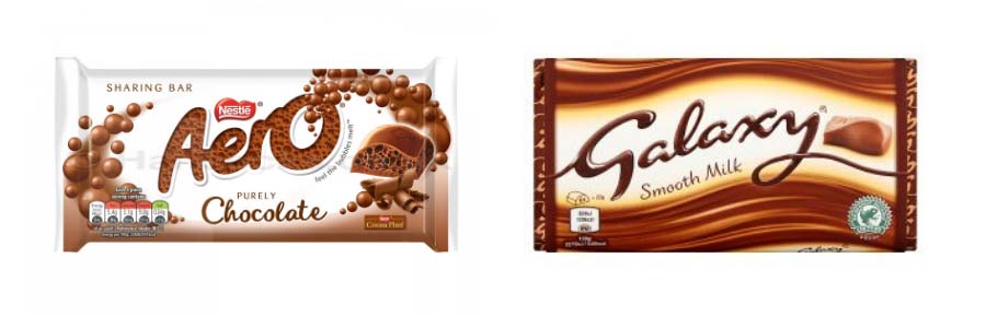
If I compare the visual appearance alone of an Aero and Galaxy chocolate bar,
 my immediate response is that I’m transported to a place of airiness and lightness of mouthfeel with Aero, contrasting with a more indulgent taste and silky mouthfeel with Galaxy. If I study both pack designs in more detail, this is further reinforced. These implicit behavioural triggers are built into the pack designs (through the typography, colour, layout etc) so our response to the pack is intuitive. Depending on my mood and needs, I may choose Aero one day and Galaxy the next.
So what feeling do you want your consumers to experience? It’s worth checking if your pack design is communicating this and whether the right cues are being triggered, and in a consistent way.
Will consumers choose to buy your pack over your competitors because it engages with them better, or does the emotional engagement need to be dialled up?
Is your pack as valuable to your brand as it could be?
