By Reach Brands
As brand strategists we spend around 30% of our working life with consumers. Recently we noticed that consumers desire to move (appropriate) brands to warmer, more comforting or passionate brand positioning areas.
In a recent article in The Guardian, The success of The Choir’s military wives suggests we’re losing our taste for malice TV, Jonathan Freedland picked up on the same consumer trend:
“…with Malone’s chart victory over Cowell presaging an era in which nice prevails over nasty, when the joy of collective solidarity edges out the cult of the narcissistic individual. Such a trend might even be a function of the age of austerity: after all, when there’s so much real pain all around, who wants to see fake malice on TV?”
For a while now the popularity of comforting consumer goods has been indicative of this trend. See The Telegraph’s article Biscuit sales soar as recession drives people to ‘comfort food’ and The Guardian article In this recession, we want comfort culture to go with our comfort food.
Now brand communications are beginning to catch up with consumer needs. For example these ATL campaigns:
- Ikea’s Happy to Bed – a far cry from the clean cold tone of Swedish minimal design; and
- John Lewis’ – The Long Wait Christmas ad – that ‘heartwarmed’ us into buying more stuff.
It seems that in hard, cold economic times, consumers seek altogether softer, warmer, more uplifting brand products and communications. And thus we are starting to see the consumer desire for brand positioning to be created or tweaked inline with this macro trend.
Summary
Of course!
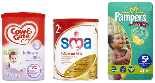
Baby branding is traditionally heartwarmingly cute and lovey. There are hearts everywhere; Cow & Gate, SMA; Pampers. But also plenty of opportunities to do this in a more ownable way.
Surprising?!
- Gu puds have been tinkering around with their brand equities as they extend the range and the result has been some warmer, friendlier looking packs. More on Gu Puds below.

Gu core Gu after dark
- Zeal cookware repositioning. Their main competitor Joseph Joseph looks cold and out of touch by comparison, it’s a big move from the technical masculinity of the old positioning. And all in a category that can often be been cold, clinical and austere.

Old logo New logo
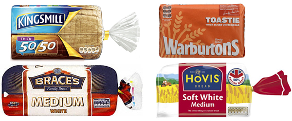
- The bread category got to a point where everything had the same fairly cold, superior, heritage feel. Although product propositions are never going to be radical Warburtons have made strides to differentiate there brand as warmer, approachable and reflect the comfort factor of their bakery products.
Opportunities?
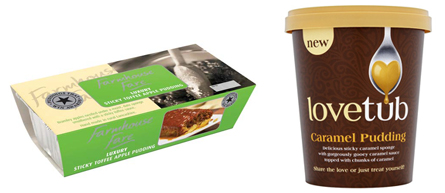
- In all comfort foods, such as confectionery, biscuits, desserts and puddings, there is a lack of warmth and comfort. It feels like all brands have shied away from these connotations in a bid to become healthier; worthy or simple and modern. But where are our cosy comfort brands when we need them?The Daniels group are already working the trend with Love Tub (previously Farmhouse Fayre):

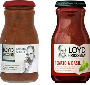
Even Mrs Crimbles the ultimate worthy ‘free from’ brand have warmed things up by building on the home made comfort-factor, instead of their traditional ‘good for you’ values: - Home cooking – As the competition stiffens and the novelty wears off brands will do well to realise you need to do more than look “premium” or include an image of a celeb chef on the pack. Clever brand owners are realising that home cooking is about passion and creativity and providing nourishment/care/excitement for people you love. See for example the Loyd Grosman sauces below.
What to ask to embrace this consumer trend?
What should you be asking yourselves and your consumers if you are thinking of embracing the love & comfort trend within your organisation’s NPD?
Here are a selection of questions inspired by four brands that are working this consumer trend:
Pack redesign: Loyd Grosman brand repositioning
- Which elements of our brand values can be drawn out to communicate a warmer, more heartwarming emotional benefit? For example is it simply about the warmth and comfort that our product offers? Or is it more about the passion that our champion has for food and cooking?

Old brand design New brand design
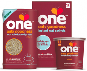
New product: One (love)
- Our new product positioning is particularly serious and worthy – how can we make it more accessible?
- A heart shape is a clear and quick way to communicate love and care into the brand? But is it ownable within our category?
- What does a heart shape signify in our category? Does it stand for caring and fuzzy do-good feelings? Or is it about heart health? If it is about heart health will this confuse potential consumers?
Brand repositioning: Warburtons
- Can a subtle adjustment to our brand achieve our aim of being seen as friendly, more accessible and down to earth and reflect the comforting nature of our products? Or do we need to drop our current equities altogether to achieve it?

Old brand design New brand design
New products: Gu Puds
- Is our brand beginning to look out of touch by looking cold and sterile in an age of austerity?
- Can some of our new product launches embrace a friendlier, more comforting feel? Or does this feel at odds with our core brand values?
- How can we inject some comfort appeal into our brand in a way that feels right for the brand? For example could we play up luxury and decadence in a stylish way to give a richer, deeper feel without becoming too brassy or twee?

Gu core Gu after dark
