![]() By Caroline Hagen
By Caroline Hagen
Have you ever wondered whether your pack design is working hard enough for your brand?
When you’re walking around the supermarket do you ever look at brands in your category or indeed other categories and think they are doing a better job than your brand?
Do you sometimes find yourself at the checkout with a product that you hadn’t bought before but just felt compelled to buy? Do you think consumers sometimes buy your product for the first time just because they love the packaging design or it “just felt right” for them?
This article sets out to help you work out if your pack design is doing a good enough job for your brand and product and, if not, how to think about improving it.
The key points to remember are that to be really valuable and therefore effective, pack design must:
- Reflect a brand’s attributes
- Communicate the brand or product benefits
- Look appealing to the target audience
- Promote the brand’s difference and therefore uniqueness in the category
What does valuable pack design look like?
Let’s take an example: tea packaging
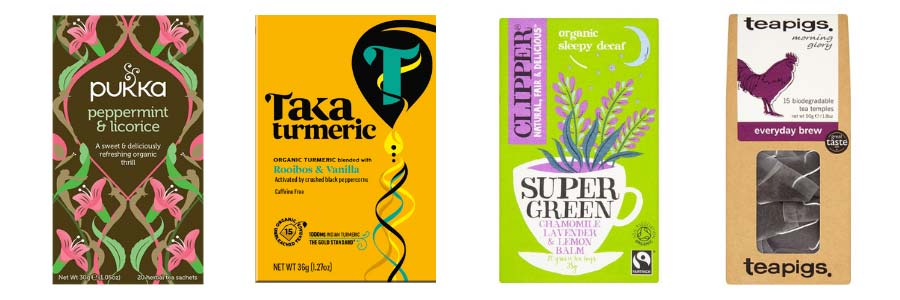
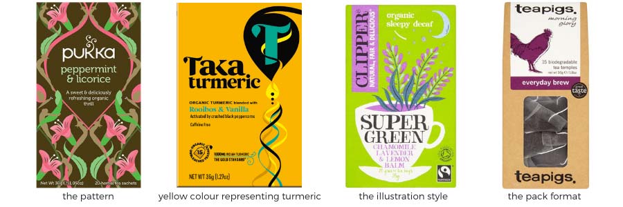
Here are 4 very different pack designs, each is effective and valuable. This is because each design can only belong to those brands, i.e. they own a unique shape, pattern, colourway, illustrative style.
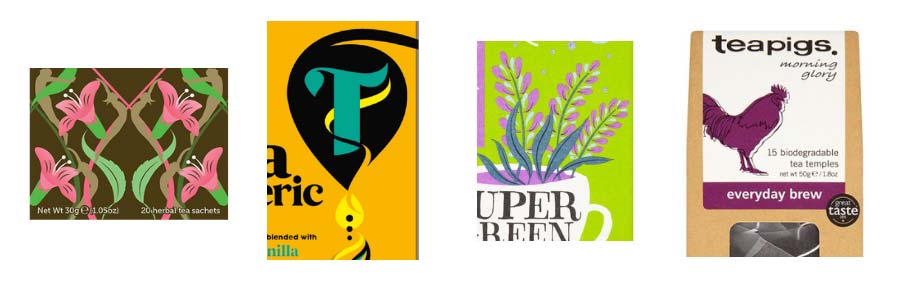
Furthermore, each design appeals to a different consumer need:
- The elegance and calm of Pukka’s pattern appeals to consumers hoping for balance in their lives; their teas are expert blends of wellbeing ingredients.
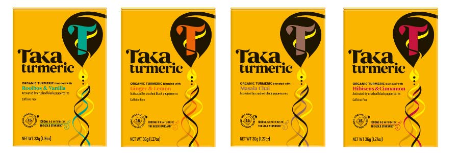
- Taka’s icon signals to those who are seeking the well-known benefits of turmeric; the teas are clever blends of ingredients that activate the medicinal benefits of turmeric. Read our brand creation & packaging design case study for Taka Turmeric here.
- Clipper’s hand-drawn illustrative style appeals to ethical tea drinkers; their teas are organic and the ingredients traded fairly
- Teapigs is for the independently minded; their off the wall name and quirky pack design match the revolutionary (when it first launched) teabag format.
The 5 rules of valuable pack design
As well as creating appeal to a particular target audience, a valuable pack design should:
- Be visible. Enable your target consumer to see your brand on shelf
- Tell the product story. Make your product relevant
- Engage, resonate and appeal to your consumer
- Work hard in the home – continue engaging but also be helpful and easy to use
- Be unique. Enable the consumer to quickly recognise your brand when shopping next time
Here are some tips on what to consider in terms of graphics and pack format to achieve valuable pack design.
1. Be visible
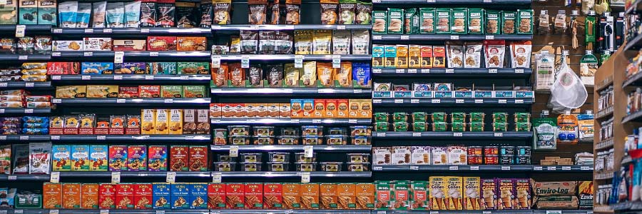 Without shelf impact you won’t ever be seen, so you may as well give up! Your consumer coming back to repurchase won’t be able to find you quickly enough; and a potential consumer shopping the category for their usual brand won’t notice you so won’t try you.
A great way to stand out is to be different, but just how different you are depends on where you sit in the category. A challenger brand in a category will look very different and play by their own rules. A brand leader has most likely built strong visual equity that is unique to them and is to be nurtured. A standard player in the category will be less remarkable and has more to achieve by creating some difference.
HOW to be visible: using graphics
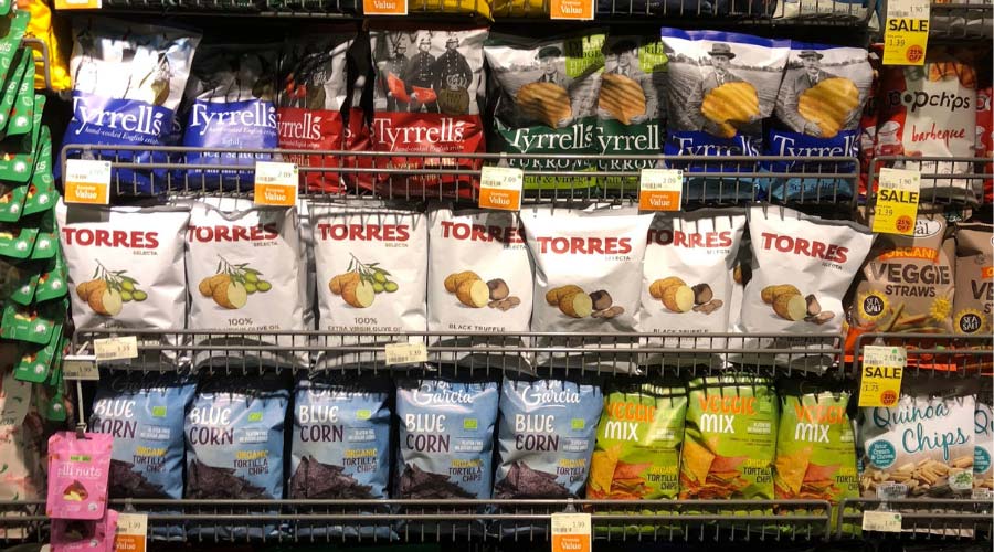
- Colour: use a colour that is unusual in the category, or a dark shade where the rest is light, a pattern of colour where the rest are plain
- Iconography: create a unique shape that jumps out on shelf
- Typography: use an impactful unusual font
- Ingredients/usage: challenge the norm
HOW to be visible: using pack format
An unusual pack shape or format can really help a consumer spot you. Consumers tend to scan shelves for pack format to find what they are looking for before honing in on the graphics.
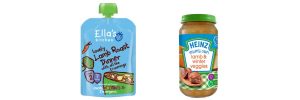
Think of Ella’s kitchen when they launched the pouch format into the babyhood category. Now that their competitors and new brands have adopted this format, it is no longer a point of difference and it is down to their graphics to give them visibility on shelf.
2. Tell the product story

The consumer has spotted your pack because it stands out and is different. Now the challenge is to be relevant, to be the product they are looking for. If you don’t quickly tell your consumer what type of product you are, you will lose relevance instantly. Their eyes will move on to a pack they understand and your chance for a sale will be lost.
HOW to tell the product story: using graphics
There may or may not be particular visuals rules for your category. For instance, in teas or beer or wine, there are few rules to follow as the category offers so much choice. Pack format may be sufficient to tell the consumer what your product is, e.g. a tub in the butter category signals “spreadable”. Otherwise, just be really clear to state what your product is if it is not immediately visually evident from the graphics or the structure. If your product is new or unusual in the category, it is particularly important to flag exactly what it is to the consumer.
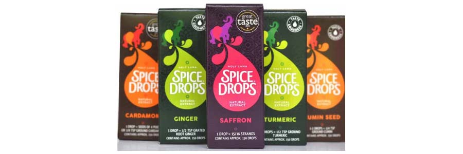
Secondly be sure to clearly flag the benefits and if these give your product competitive edge, then even more so. Don’t, however, crowd the front of the pack with benefits; remember back (or side) of pack is also available

HOW to tell the product story: using pack format
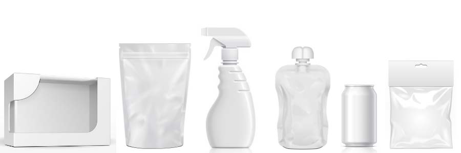
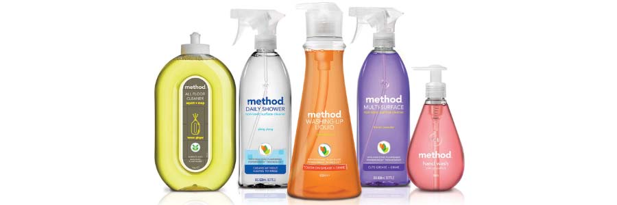
Pack format is usually the best way for a consumer to understand your product. For example in the household cleaning category a trigger spray will communicate ‘ready to use’ whereas a bottle means ‘dilutable’. Read our packaging design case study for Mr. Sheen here.
If your pack and brand design is particularly unusual for the category, you might want to stick to the standard expected pack format for the category so the consumer knows what type of product you are.
3. Engage

This is where you win the heart of your consumer; your consumer engages with your brand because it represents values that resonate with them. The design styling fits with their own design aesthetic. They like the look of you. This is the point at which they reach for the pack and it either ends up directly in the shopping basket OR they pause a couple of moments more by looking at the back of pack to interrogate the ingredients or to investigate the benefits or to read the brand story
HOW to engage: using graphics
- Use meaningful graphics to engage emotionally.
- Beautifully crafted illustration or typography can communicate care or artisanship.
- A powerful burst of colour or light communicates strength or efficacy or a bold attitude.
- White can communicate purity or lightness.
The means of engagement using graphic design is endless….
HOW to engage: using pack format
An aesthetically pleasing format can persuade a consumer to buy a brand just as much as graphics. Unfortunately investment in bespoke structure is beyond the budget of most brand owners.
However, the rewards can be significant. Method’s investment in a beautiful transparent unusual pack structure has helped them establish themselves as the cleaning product of choice for the eco-conscious consumer. The redesign also tapped into the insight of style-conscious home-owners wanting even their cleaning products to look good in the home.
4. Work hard in the home

Once in the home the product usage, taste and experience now need to deliver. The ideal scenario is when the expectations set up by the pack design are matched or even surpassed by the product, the consumer becomes a loyalist and will repurchase. But the pack still has a role to play in reinforcing brand loyalty and driving repurchase…
HOW to work hard in the home: using graphics
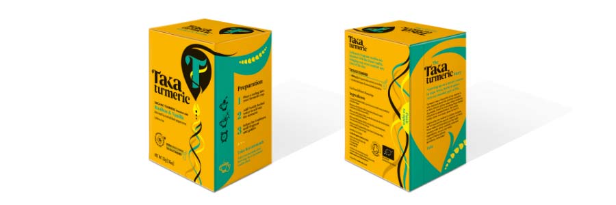
The side and back of pack should tell the brand story, thus deepening the consumer’s relationship with the brand and reasserting the resonance with the brand the consumer feels.
- Usage instructions can help the consumer to use the product for optimum results or enjoyment
- Usage ideas can encourage the product to be used up more quickly
- Other products in the range can be promoted (if you have the space)
- Encourage the consumer to engage with your brand on other platforms – online, social
- QR codes or NFC (Near Field Communication) technology can be used on pack to further engage the consumer (if you have the budget)
- A very important role for back of pack communication is to encourage the consumer to recycle or re-use the pack. If you’re an ethical brand, you can even tell them what resources were used in the creation of the pack
HOW to work hard in the home: using pack format
The user experience is often driven by pack format. We’ve all struggled with packs that can’t be opened easily – very frustrating and often likely to turn consumers off a re-purchase. However, a pack that’s nice to hold, easy to open, easy to pour, easy to reseal, easy to store is a winner and is likely to create strong brand loyalty.
5. Be unique

All the work that’s gone into steps 1 – 4 are about getting the consumer to buy your product, enjoy using it and buying it over and over again. Thus delivering a valuable loyal consumer who is likely to talk about and recommend your brand.
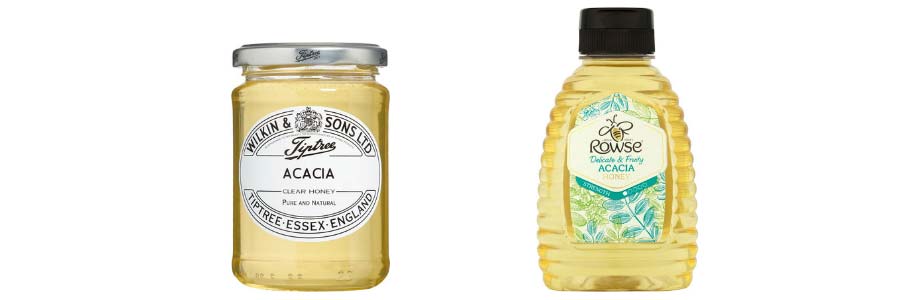
This means you need to make the re-purchasing process as easy as possible for her. When your consumer is shopping, your brand will not be front of mind; she may remember it only when she’s at your fixture. Bear in mind she’s not a loyalist yet, so may not even remember your brand name, but she will have some visual recollection of what your pack looks like. It might be the unusual pack format or the colour, the unique shape of the graphics or the way the ingredients are featured.
A unique pack design gives your brand the best chance of being re-purchased by popping out on shelf and being different.
Test your own pack design
To make sure you are getting maximum value from your packaging design, take a good hard look at it with a critical eye and with the 5 rules in mind.
- Have a look at it on shelf in the supermarket, pharmacy, independent and online: is it visible?
- Interrograte the front of pack – is it really clear what the product is?
- Talk to your consumers – do they like the design? Does it represent your brand values?
- Give it to some consumers to use in the home and get their feedback. Is it a friendly easy to use pack? Is it easy to store? Does it tell a good story?
- Check out your competitors – is your pack really different? Is it as different as you’d like it to be?
