Ardmore Whisky
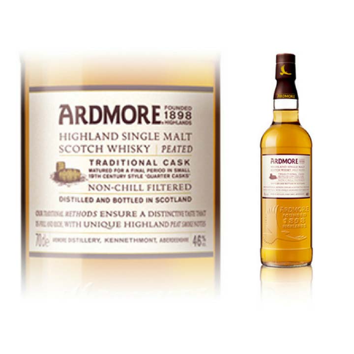
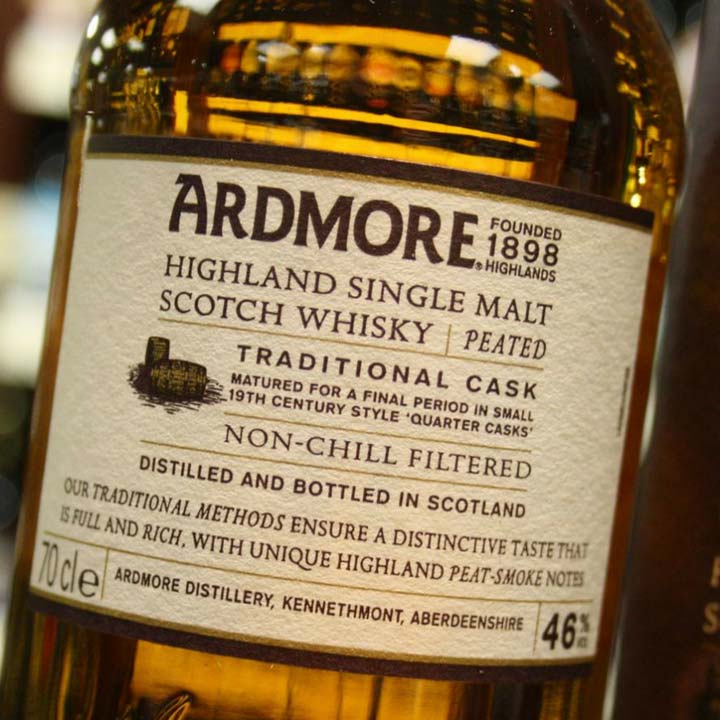
Our challenge? Packaging design to embody an accessible, friendly and helpful peated single malt whisky brand with a nice price tag – the perfect ‘gift to self’. The new Ardmore, a Jim Beam brand, needed to look equally at home in Sainsbury’s, World of Whisky Duty Free and in a drinks cabinet. Our premium packaging design delivered:
- Sales targets exceeded by 25%
- A unique icon in the category – the Ardmore eagle
- A significantly higher price premium than had been budgeted
- Instant listing in Sainsburys and global duty free
Consumer perspective
Peated single malt whiskies are usually drunk by aficionados, those with taste buds attuned to the challenges a peated malt brings. Just think of the strong, salty taste of Laphroaig – a true ‘marmite’ flavour. However, Ardmore is a peated single malt with a less challenging taste. Smooth, peaty and nutty, it has an earthy richness with honey and floral tones that’s ideal for consumers who’ve tried blended whisky, and are ready to move on to single malt – both for the taste and the kudos. What’s more, it retails around the £30 point, which is very affordable for a quality single malt. But how to communicate all of this?
Reach approach
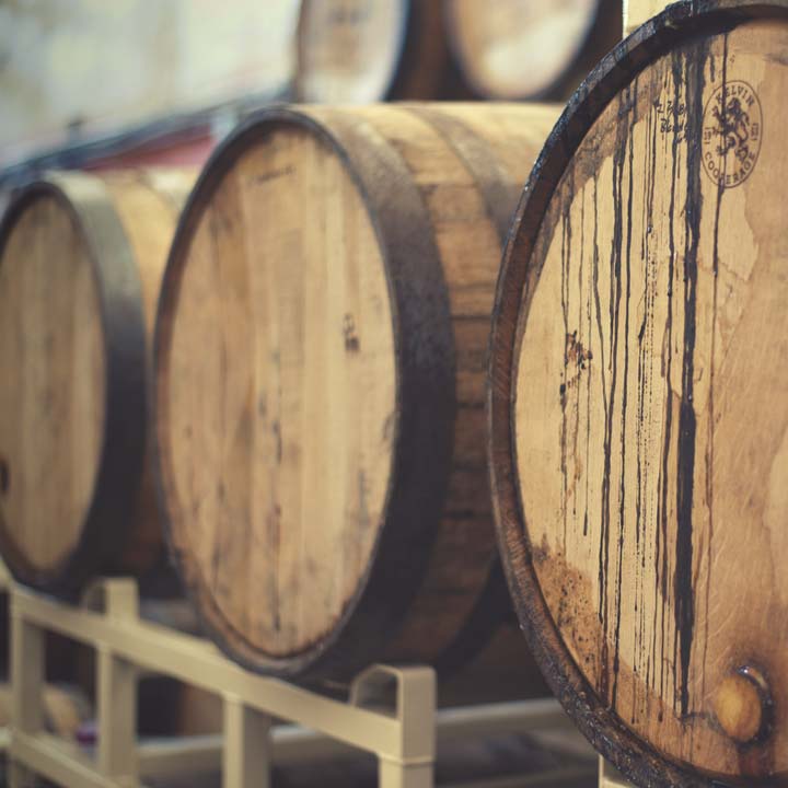
Behind every good whisky, there’s a good story (more of that on our drinks packaging design page). So to find out more about Ardmore, we travelled to the Teachers distillery where the whisky is made. After touring the moorland outside Aberdeen, the distillery and surrounding area, we felt inspired and full of ideas. With a sense of Ardmore’s soul, we ran a workshop with the client to explore and agree the best proposition and story for our new brand.
An intriguing story of a rare eagle soaring over the hills above the distillery really chimed. It felt ideal as a guide for our novice whisky drinkers, introducing them to a single malt with a complex and compelling taste profile.
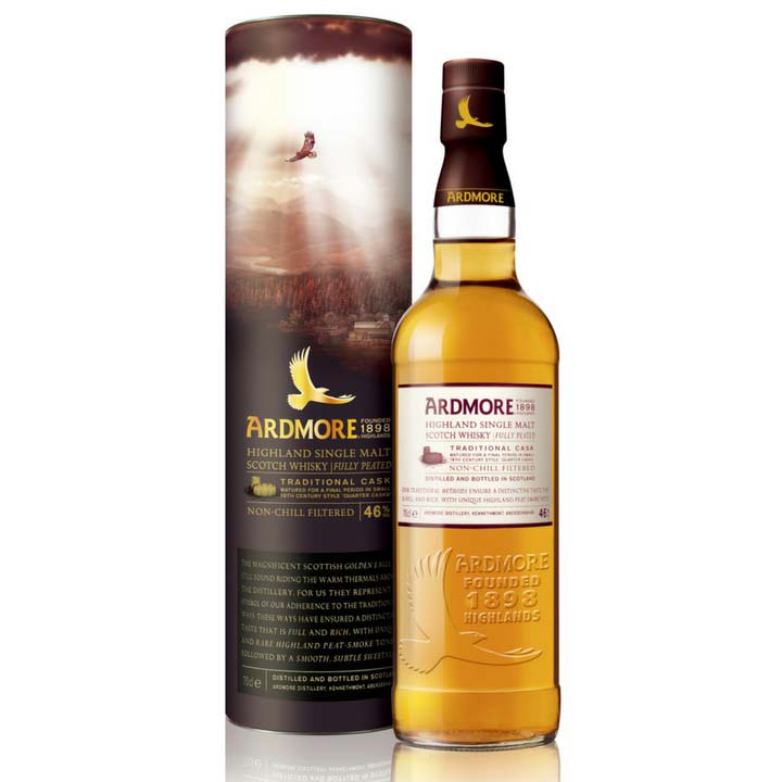
Brand story defined, we brought it to life on the bottle and the presentation packaging. This outer carton acts as a key selling tool in the highly competitive whisky fixture in Duty Free and UK multiple supermarkets, so we created imagery that would entice and reassure shoppers looking for their first single malt whisky.
Secret to success?
One of the key challenges was to make a standard off the shelf bottle look rather more unusual and premium. The outer presentation packaging design works hard to achieve this. We also embossed the bottle with our new eagle icon, creating interest and a handcrafted feel, as well as enabling Ardmore’s ownability of the eagle icon. By reinforcing a premium feel at an affordable price, Ardmore becomes a desirable ‘self gift’ when trawling the supermarket aisles for the weekly shop.
Reach delivers
The result is an accessible authentic single malt whisky brand for Europe and the USA market
The design achieves just the right balance for the positioning of this unique new single malt whisky. Although the whisky is peated, it has an accessible taste profile. The guiding eagle captures this perfectly
